THE SHORT ANSWER
If your bedroom contains furniture and finishes bought at different times, I would start with five paint families: mushroom, muted green, muddy blue-green, dusty mauve, or a deep dark color. Each gives you a different way to deal with the colors already in the room. More important, each family includes softened, complicated shades that are easier to use beside ordinary wood, carpet, upholstery, and bedding than a long list of unrelated colors.
First decide which family solves the room problem you actually have. Then bring home two shades from that family and compare each one with your flooring, your largest piece of furniture, and the bedding you use. You are not looking for the most beautiful paint chip in the store. You are looking for the wall color that makes the expensive things you are keeping look better together.
Start here: name the room problem
| Your room problem | Start here |
|---|---|
| Competing beige, gray, cream, and wood tones | Mushroom |
| Everything coordinates but feels boring | Muted green |
| Warm wood and beige need stronger contrast | Muddy blue-green |
| Dark wood feels heavy | Dusty mauve |
| You genuinely want a dark bedroom | Deep dark |
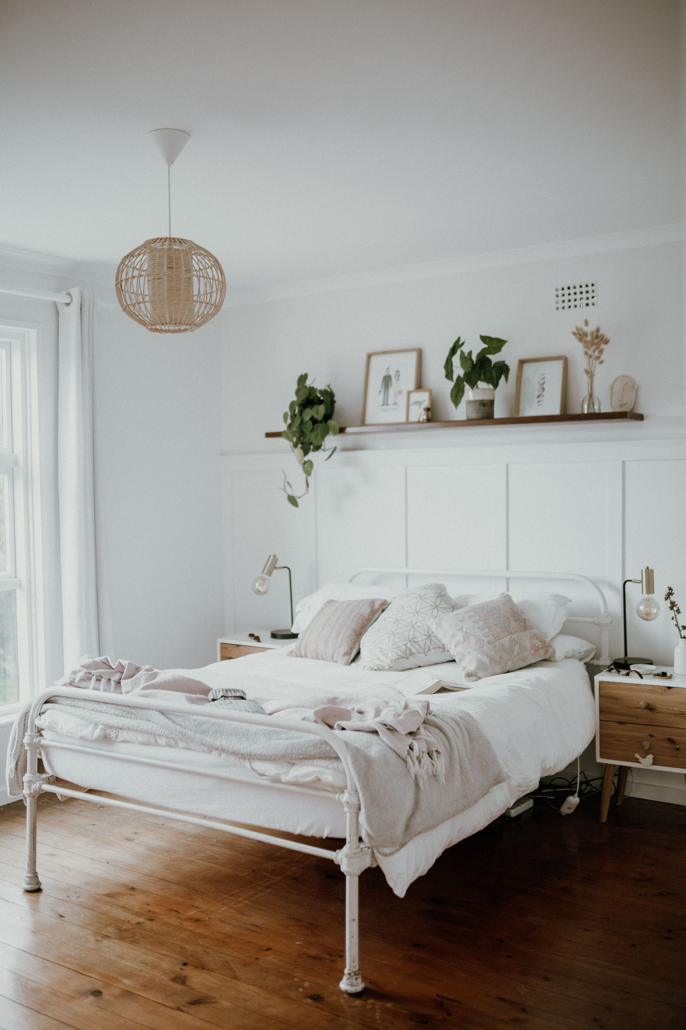
Start with what will remain after the paint dries: the floor, largest furniture, bedding, trim, and natural light. The wall color has to improve those fixed elements together. Original photo by Taryn Elliott on Pexels.
I picked five families because another list of 40 pretty colors is not much help
Most bedrooms were not designed in one afternoon. They happened. The dresser came from one house, the bed came later, the nightstand was inherited, and the flooring may have been there before you were. You can have a gray upholstered headboard beside an oak dresser, beige carpet under both, and a cream quilt you genuinely like. None of those things is necessarily a decorating mistake. They simply were not selected together.
Search for bedroom paint ideas and you can easily find forty attractive colors, each photographed in a room designed to make that color look good. The rug agrees with the wall. The wood is the right wood. The bedding was chosen after somebody already knew the paint color. The photograph proves the paint can look beautiful somewhere; it does not tell you whether it will improve the bedroom you own.
This shorter list has a reason behind it. Mushroom can contain gray, beige, brown, and a little pink. A muted green may contain gray or blue. Dusty mauve can sit somewhere among rose, brown, gray, and purple. That complexity is useful because real materials are complicated too. “Beige carpet” may look yellow beside one wall and pink beside another. Oak can contain honey, orange, brown, and sometimes pinkish tones. Cream bedding changes with what surrounds it.
That is why words such as mushroom, muddy, dusty, smoky, and muted keep appearing here. Gray, brown, or another muted undertone takes some purity out of the hue, so the wall is less likely to exaggerate every difference among the wood, carpet, upholstery, and bedding.
Before you choose a family, identify the three things that are expensive or annoying to change: the flooring, the largest piece of furniture, and the bedding you use most often. If a wall color makes those three things look worse, I do not care how beautiful the chip looked under store lighting. The paint is the easier thing to change.
Mushroom is where I would start when every neutral in the room is a different neutral
START WITH TWO SAMPLESMushroomStart with Shiitake SW 9173 and Studio Clay SW 9172. You do not have to use either one. Together, they show the warm gray-brown range I mean by mushroom.


Mushroom is useful when almost everything is neutral and the room still does not come together. You may have beige carpet, a gray upholstered bed, cream bedding, a dark brown dresser, and white trim. On paper, none of that sounds difficult. In the room, the beige may make the gray feel blue, the gray may make the carpet look yellow, and the dark furniture may seem much heavier than everything around it.
Neutral does not mean undertone-free. Beige can be yellow, pink, peach, gray, or greenish; gray can lean blue, violet, green, or brown. Put two neutrals with different undertones together and each can make the other look more extreme. A distinctly yellow-beige wall may make a cool gray bed look almost blue. A cool gray wall may make the carpet look yellower.
A good mushroom shade sits between those extremes. It has more gray than a conventional warm beige and more warmth than many cool grays. The carpet remains beige and the bed remains gray, but the wall stops advertising the difference. Mushroom can also connect a walnut dresser and medium-oak nightstand without imitating either one. In a room with three woods, matching one too closely can make the other two look even more unrelated.
White painted furniture and trim are useful checks here. If a mushroom sample makes the white look pleasantly soft, the room may be gaining warmth. If it makes the white look dingy or nicotine-yellow, the sample is probably too muddy for that particular white. The wall should mediate among the finishes, not make the cleanest surface look unclean.
I would consider mushroom first when the complaint is, “Everything in this room should go together, but somehow it doesn’t.” It is less useful when what you really want is obvious color. Mushroom can make a room quieter and more coherent, but it is still a neutral family.
There is one reason to be careful: mushroom covers a wide range. Some versions lean pink, some violet, some brown, and some sit close to gray-beige. Put a pinkish mushroom beside strongly yellow carpet or golden oak and the wall can look pinker while the finish looks yellower. Neither material changed. The contrast exposed undertones that were easier to ignore before.
Start your sample search with Sherwin-Williams Shiitake SW 9173 and Sherwin-Williams Studio Clay SW 9172. You do not have to use either one. Together, they show the warm gray-brown range I mean by mushroom. Put both beside the flooring and the palest textile in the room; keep the one that quiets the undertones without making either surface look dirty.
Muted green is my first choice when the room matches perfectly and is still boring
START WITH TWO SAMPLESMuted greenStart with Clary Sage SW 6178 and Evergreen Fog SW 9130. You do not have to use either one. Together, they show the softened gray-green range I mean by muted green.


Some bedrooms have the opposite problem. The oak dresser looks fine with the tan carpet. The cream bedding works with the ivory curtains. The wicker basket belongs. Nothing is fighting, and nothing is particularly wrong. The room has simply become beige, cream, tan, oak, linen, brown—and flat.
Muted green introduces actual color without making every other object feel as though it now has to coordinate with GREEN. The muting matters. A clear emerald, bright leaf green, or icy mint creates sharper contrast. Sage, gray-green, and mossy green still read as green, but gray, brown, or blue has softened the hue enough to sit beside ordinary materials.
Wood is where this family earns its keep. Oak already contains yellow, orange, and brown. Against a bright yellow-green, those warm notes can become exaggerated until the combination feels almost citrusy. Against a grayed sage, you still get contrast, but the gray softens it. The cooler wall makes the warmth in the wood easier to see; the warm wood gives the green enough contrast to read clearly as green.
That is why I prefer green to another neutral when the main complaint is boredom. If the materials already cooperate, I do not need the wall to reconcile them. I need it to give them something more interesting to sit against. Muted green is especially useful with oak, wicker, linen, tan carpet, warm white, cream, black metal, brass, and medium-brown wood.
Gray upholstery can work too, but it changes the test. A blue-gray headboard may pull a gray-green sample cooler than the same color looked beside oak. Keep the green if that cooler shift makes the room feel fresh; reject it if the headboard and wall start forming one chilly block while every warm material sits apart.
The failure mode is choosing the wrong green within the family. Too much blue in a pale sage can push it toward mint, especially in cooler light. More yellow moves it toward olive. Either may be beautiful, but they create different rooms. If the sample looks minty beside the comforter and you wanted quiet and earthy, do not buy accessories to justify it. Try another green.
Compare Sherwin-Williams Clary Sage SW 6178 with Sherwin-Williams Evergreen Fog SW 9130. You are testing how much warmth, gray, and depth the existing wood can carry—not choosing between a “good” and “bad” green. Look at both under daylight and your usual bedside lamps before deciding.
Muddy blue-green works when the room needs more contrast than sage can give it
START WITH TWO SAMPLESMuddy blue-greenStart with Underseas SW 6214 and Studio Blue Green SW 0047. You do not have to use either one. Together, they show the smoky blue-green range I mean by muddy blue-green.


Blue-green is a bigger move. I would look at it when a bedroom has plenty of acceptable things and still feels stale: medium-brown furniture, gray upholstery, cream bedding, beige flooring, black lamps. Muted green can freshen that room. A smoky blue-green gives the warm materials a stronger cooler contrast, so the before-and-after is more obvious.
I am using muddy deliberately. Bright turquoise is a specific decorating decision. Once the walls are turquoise, the whole room has to contend with turquoise. A blue-green softened with gray or brown is easier to put beside furniture and textiles that were never bought with teal walls in mind.
Warm wood is where this family becomes especially interesting. Walnut surrounded by beige carpet, tan walls, cream bedding, and brown furniture can disappear into one field of warm color. Put it beside smoky blue-green and the warmth in the wood becomes easier to see. The green keeps the wall from reading as an icy blue-gray; the gray or brown in the paint keeps it from turning tropical.
That is why I like this family with walnut, medium-brown wood, camel, cream, brass, black, leather, and gray upholstery. Those materials can handle a stronger wall, and many look better once they are no longer surrounded exclusively by warm neutrals.
Depth matters as much as hue. A pale blue-green keeps more visual space around heavy furniture; a midtone gives the furniture a stronger background and makes cream textiles brighter. If the dresser still looks like the room’s only substantial object, the sample may simply be too pale to do the contrast job you chose this family for.
The tradeoff is light. Blue can become much stronger in cool daylight, and a color that looks beautifully smoky on a warm afternoon may feel colder on a gray morning. Pay attention to both daylight and lamplight, especially if the room faces north.
Start with Sherwin-Williams Underseas SW 6214 and Sherwin-Williams Studio Blue Green SW 0047. Together, they define the cool, grayed blue-green territory I mean. Judge them beside the warmest wood in the room: the right sample should make the wood look richer, not louder or more orange.
Dusty mauve is what I would try when dark wood needs softness rather than more beige
START WITH TWO SAMPLESDusty mauveStart with Thistle SW 6283 and Studio Mauve SW 0062. You do not have to use either one. Together, they show the softened gray-rose range I mean by dusty mauve.


This is the least obvious family on the list, and probably the one I would defend most strongly. A bedroom full of dark brown furniture creates a predictable reaction: paint the walls something pale and neutral. Sometimes that is exactly right. Sometimes it leaves a room made almost entirely of brown, beige, and cream, with the furniture still feeling heavy because light walls have not given it anything interesting to relate to.
The mauve I mean contains gray, brown, rose, and purple in varying amounts. It is not clean pink-purple. Dusty mauve is useful because it sits close enough to brown and taupe to understand the furniture while still being clearly different from brown.
Dark wood is more complicated than it appears. Walnut can contain reddish or purplish notes. Mahogany often carries obvious red. Espresso finishes may read almost black in one light and warm brown in another. A grayed mauve can pick up quieter red or purple undertones without repeating the furniture color. The result can make dark wood feel richer and less severe.
Cream bedding gives this combination a necessary light area between deeper walls and dark furniture. Brass catches light and reinforces the warmth already present. This is why I would consider dusty mauve in a traditional bedroom instead of automatically trying to make the furniture look contemporary with pale gray. An old walnut dresser does not need to apologize for being an old walnut dresser.
Pink-beige carpet or blush bedding can make this choice easier because the wall repeats a trace of color already present. But repetition is not automatically harmony. If the room starts reading as one continuous field of pink-beige, move toward a grayer mauve or leave this family. The goal is softness with separation, not accidental matching.
The failure mode is warm artificial light. Mauve can become unmistakably pink under warm lamps, and a shade that looked beautifully dusty in daylight can become sweeter than you intended at night. Look for enough gray and brown to keep the rose or purple from becoming sugary.
Compare Sherwin-Williams Thistle SW 6283 with Sherwin-Williams Studio Mauve SW 0062. Put both beside the darkest wood and ask one question: does the wood look richer and the room softer, or did everything become heavier? Check again after dark before you trust the answer.
Dark paint can pull mismatched furniture together by reducing all those separate dark shapes
START WITH TWO SAMPLESDarkStart with Iron Ore SW 7069 and Urbane Bronze SW 7048. You do not have to use either one. Together, they show the deep charcoal-to-bronze range I mean by dark.


I would only recommend this family if you genuinely like dark bedrooms. A room can be beautifully decorated and still be wrong for the person sleeping in it. If you keep turning on every lamp because you dislike darkness, do not let somebody else’s photograph talk you into charcoal walls.
If you consistently save dark bedrooms and love how they feel, dark paint can solve mismatched furniture differently from the other four families. With pale walls, every dark piece creates a strong outline. The brown dresser becomes a dark rectangle against a light background. So do the nightstand and headboard. If those pieces do not match, your eye registers each separately because the contrast around each is so strong.
Dark walls reduce that contrast. The dresser is still there, but its outline is less stark. Several different pieces can begin to read as one larger dark composition instead of a row of unrelated brown and black blocks. At the same time, lighter things gain importance. Cream bedding looks brighter. Brass catches your eye. A pale lampshade matters more. Medium wood can look warmer because it sits against something darker than itself.
Dark does not have to mean plain black. Deep bronze, green-black, aubergine, navy, smoky brown, and warm charcoal each cooperate with different materials. Brown-charcoal is easy beside camel and warm wood. Green-black can be excellent with cream, brass, and natural wood.
Look at the amount of pale material that will remain after the walls go dark. White paneling, a large cream headboard, light curtains, or generous bedding can create enough relief. If almost everything in the room is already medium or dark, paint a large sample before assuming one pale lampshade will provide the balance shown in a styled photograph.
Lighting matters more here. If the room already feels dim because it has one weak overhead fixture or one small bedside lamp, solve that practical problem rather than expecting paint to do it. One sad bulb on a dresser is not a lighting plan.
Start with Sherwin-Williams Iron Ore SW 7069 and Sherwin-Williams Urbane Bronze SW 7048. They show two useful directions: charcoal and brown-bronze. Use the one that makes the furniture recede without flattening every warm material in the room.
Once you have a family, stop collecting paint colors
Choose mushroom if several neutrals need help getting along. Choose muted green if the room coordinates but needs color. Look at smoky blue-green if warm wood and beige need stronger contrast. Try dusty mauve if dark brown furniture feels heavy and you want softness without another neutral. Go dark if you genuinely want the walls themselves to become a major part of the room.
Then bring home two colors.
Two is enough to make a comparison without starting the entire search over. Use large samples if you can. A tiny chip tells you roughly what color the paint is; a larger sample starts to show what the color does to everything around it.
Keep the sample finish in mind as well. A glossy sample can reflect more light than the matte or eggshell wall you intend to paint, while a paper chip cannot show the wall texture at all. You are testing a color relationship, not rehearsing an exact final surface, so give a promising sample a little tolerance without explaining away an obvious undertone problem.
Put each sample near the flooring first, because carpet and wood can pull out undertones you barely noticed in the store. Move it beside the largest piece of furniture and watch whether the wood or upholstery starts looking warmer, cooler, yellower, redder, duller, or cleaner. Then look near the bedding you actually use. Bedding occupies a lot of visual space, so a wall color that makes the quilt look dingy will not become more charming after you paint four walls.
Do not press the two samples directly against each other. Then you begin judging Paint A against Paint B instead of judging each paint against the room. Give them space. Look during daylight, then come back after dark with your normal lamps on. A color that looks sophisticated at noon can go icy, pink, muddy, or unexpectedly bright at night.
Reject the color when it makes something expensive look worse
You do not need a scorecard. If the beige carpet suddenly looks peach, pay attention. If pleasant oak turns aggressively orange, pay attention. If cream bedding looks old and yellow or the gray headboard turns violet, the sample has exposed a relationship you probably do not want across four walls.
That does not mean the paint is ugly. It means the paint is wrong beside something you intend to keep.
Paint is the easy part to change. Do not buy new curtains to make a questionable sample work. Do not replace good bedding because you fell in love with a chip. Do not decide the dresser has to go because one green makes it look orange. Try another shade. If several shades from the family create the same problem, change families.
If both samples work, pick the one you like better and stop
There is a point in paint shopping where people create a new problem because the original problem has already been solved. Both samples look good, so they go back for six more.
If both work with the flooring, furniture, and bedding, you no longer have a coordination problem. You have two good choices. Pick the one you prefer.
If you mostly see the bedroom after work and before bed, give the evening appearance more weight. If the room is flooded with morning light and that is when you love being there, judge it more heavily in the morning. Evaluate the color under the conditions that matter in your life instead of chasing one theoretically perfect shade under every possible light.
Once one sample works with the room and you simply like it better, that is enough. Write down the manufacturer, name, and number. Buy the paint. Stop shopping.
PAINT MY ROOM · IN DEVELOPMENT
Color chosen? The next problem is getting it onto the wall.
Paint My Room is being built for what comes after the color decision: how much paint to buy, whether primer earns its place, which supplies you need, what the job should cost, and how to paint a bedroom over a weekend without spending Saturday making three emergency trips to the hardware store.
GET THE NEXT STEP
Join the waitlist and I’ll let you know when Paint My Room is ready to turn a chosen color into a finished weekend job.