There is a particular stage of being tired of your bedroom where you start blaming the dresser.
The dresser was apparently fine for seven years. Now it is ugly. The curtains look cheap. The bedding looks tired. The lamp has personally offended you.
You spend twenty minutes on Pinterest and discover that the obvious solution is a new bed, a vintage rug, linen curtains, two walnut nightstands, a $400 light fixture, and a woman in Vermont who makes ceramic lamps by hand.
No.
Before you replace a perfectly functional room because you are bored with it, change the thing covering more square footage than almost anything else in the room: the walls.
THE RULEIf the furniture is staying, the paint has to make the furniture look better.
Most people start with a color they like. Three days later, the beige carpet looks pink and the oak dresser has turned aggressively orange. The room was supposed to be a paint-money refresh, not a paycheck—or two—and a full redo.
Spend paint money. Get a different room. Leave the rest of your stuff alone.
START HERE
What is wrong with the room?
Do not pick the prettiest isolated color. Pick the family that fixes the complaint.
FIRST, LOOK AT WHAT PAINT CAN DO
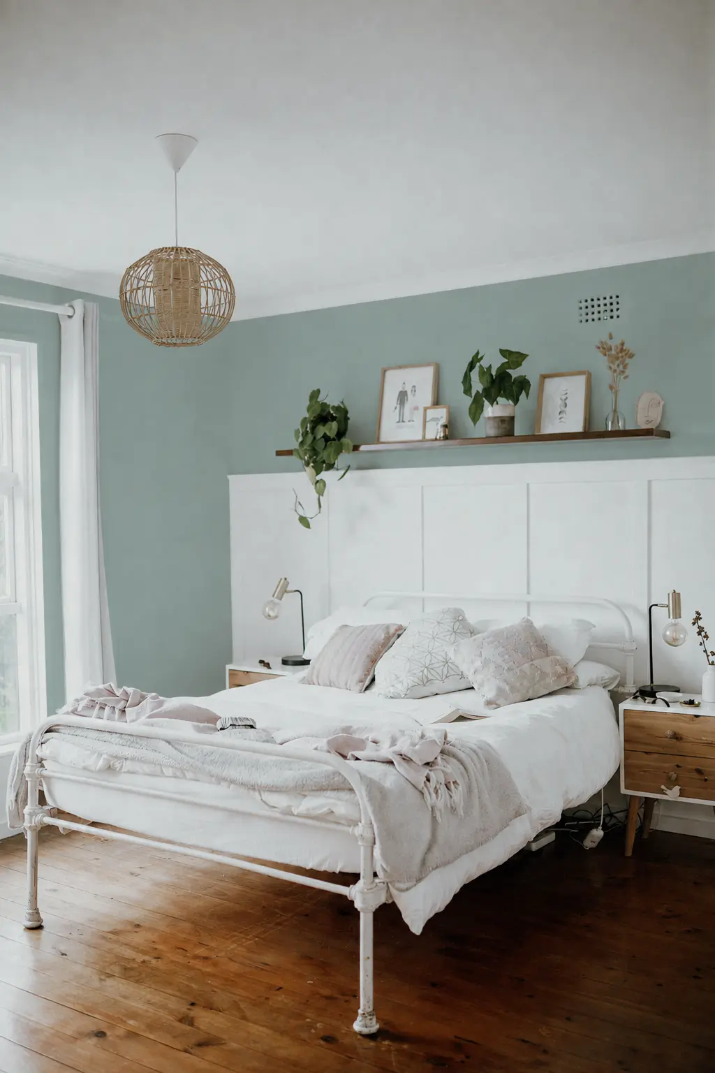
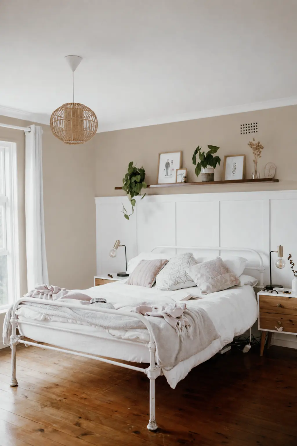
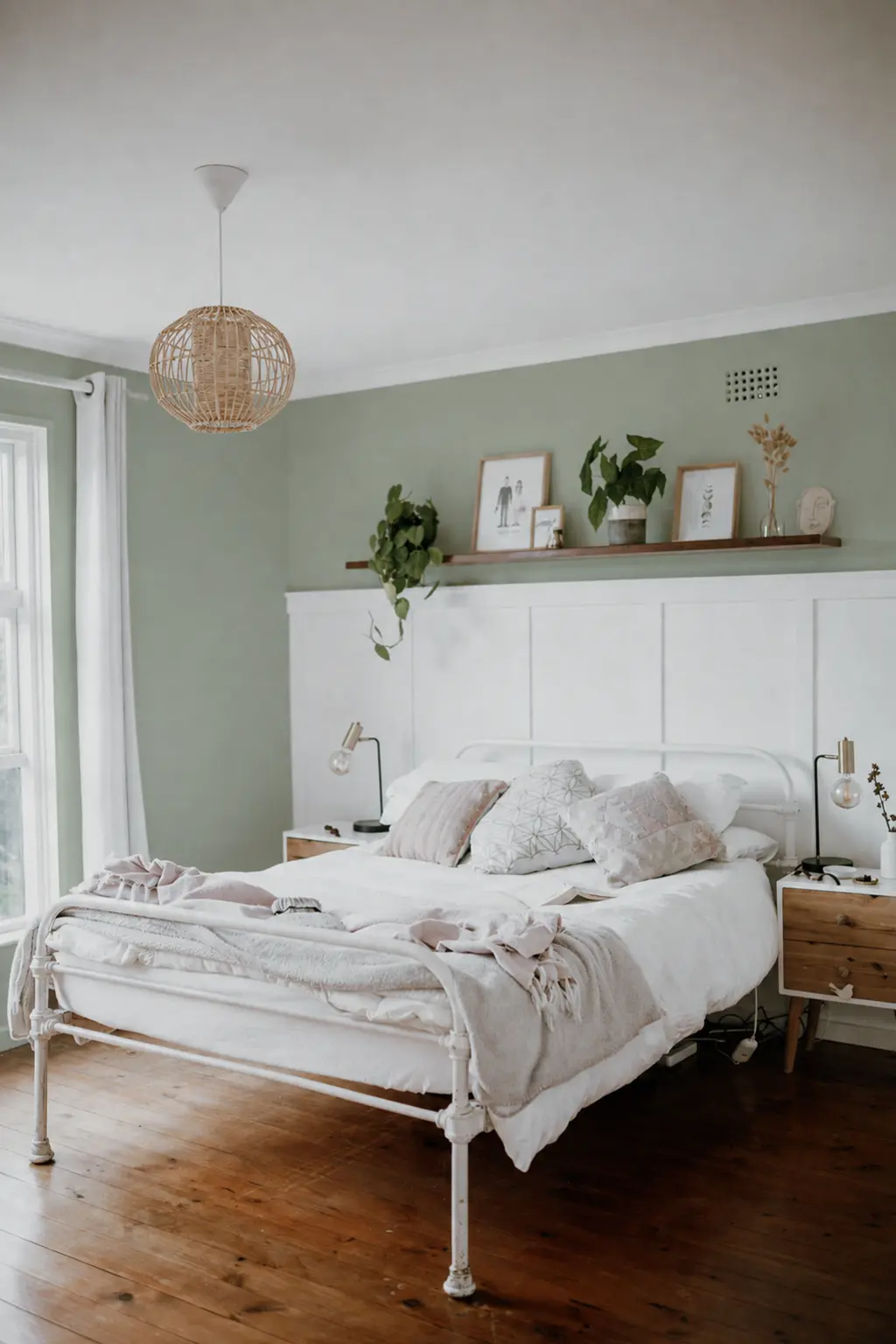
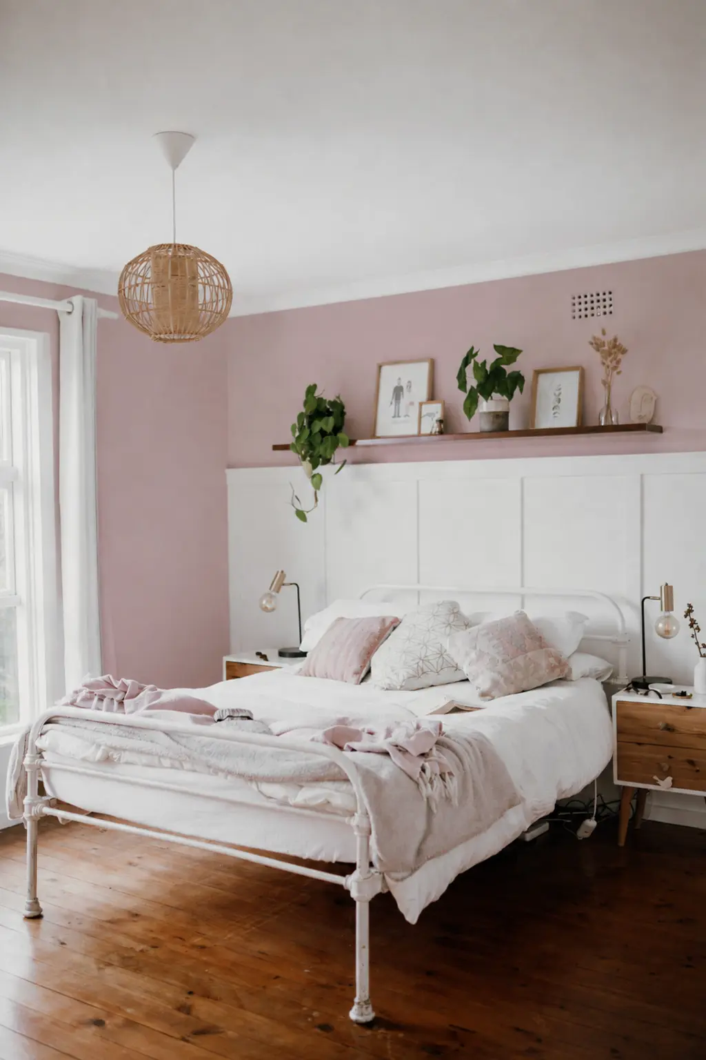
One room. Five wall colors.
Same bed. Same furniture. Same bedding, lamps, curtains, art, floor, crop, and light. Only the upper wall color changes.
Wall colors are digitally edited to compare color families—not exact paint matches. Original room photo by Taryn Elliott on Pexels ↗
HOME MISSIONS RULE 01
Your furniture gets veto power.
Before you look at another paint chip, identify the three biggest things you are definitely not replacing: flooring, bed or headboard, dresser, bedding, curtains, or rug.
The Veto Rule: anything expensive, permanent, or staying gets veto power over the thing you are changing.
If you own warm beige carpet and orange-ish oak furniture, you do not have an imaginary white-oak-and-linen bedroom. You have beige carpet and orange-ish oak furniture. Work with the room you own. Pinterest will survive the disappointment.
BEFORE YOU CHOOSE
Figure out what the room is doing to color.
The little square in the paint store is not the color. Your bedroom has its own agenda.
North-facing rooms generally receive cooler, weaker light. South-facing rooms tend to get warmer, more consistent light. East- and west-facing rooms change substantially over the day. Judge the color when you actually use the room—not only at 2:15 on a Tuesday when nobody is in there.
If the room is dark, learn one number: LRV. Light Reflectance Value runs from 0 to 100 and describes how much light a color reflects. It does not tell you whether the color is attractive. It tells you whether you are buying something light or something that plans to sit there and brood.
Sherwin-Williams: choosing color by room orientation and LRV ↗
01 · ROOM FEELS NOISY
Go muddy blue-green.
Not turquoise. Not nursery blue. Not “coastal.” If a throw pillow has a seahorse on it, we have gone too far.
I mean the colors that make you argue with yourself about whether they are blue, green, or gray. That uncertainty is useful. You get color without demanding that the rest of the room become part of A Theme.
Muted blue-green is usually cooperative with warm wood, cream bedding, tan, black, brass, and white curtains. The walls become interesting enough that nothing else has to try very hard.
Choose it when
You have medium or warm wood furniture and a lot of cream, beige, white, tan, or black. The room feels visually tired rather than genuinely dark. You want an obvious change without opening the door to a room shouting BLUE BEDROOM.
This family earns its place when several ordinary things need a background that quietly connects them. A black lamp stops looking accidental. Warm wood looks warmer, but not necessarily louder. Cream bedding gets contrast. White curtains stay white instead of becoming the only visual decision in the room.
Skip the coolest version when
You have one sad north-facing window and the room already looks like February at 4:45 p.m. Move toward the greener, warmer, or lighter end—or start with mushroom.
Digital references only. Sample real paint in your room.
02 · ROOM FEELS MISMATCHED
Go mushroom or taupe.
This is where I send the person who says, “I just want it to look better. I do not want to build a color palette. I have a job.”
Excellent. Stop painting everything pale gray.
What you want is a warm, muddy neutral with enough depth to make the room intentional: mushroom, putty, stone, taupe, oatmeal, warm greige, or coffee with an irresponsible amount of cream.
This is my default recommendation for the largest number of tired bedrooms. Real bedrooms contain an oak dresser, a black nightstand, a beige upholstered bed, cream bedding, beige carpet, one brass lamp, and one black lamp because the brass one broke. This is a room accumulated by an adult over time. A good mushroom makes those objects look like they had at least met before moving in together.
Especially consider it with beige or cream carpet, warm oak, walnut, brown furniture, mixed black-and-wood pieces, warm white bedding, brass, or a north-facing room. Mushroom is not exciting in isolation. That is part of its usefulness. It lets the entire room become the answer.
Make it earn Saturday
Do not choose a mushroom so pale that the finished room looks like someone moved the brightness slider 3%. Hold it beside the existing wall. The change does not need to be dramatic, but it needs to earn Saturday.
Warm beige carpet plus strongly pink taupe can make the carpet look pinker. Orange oak plus yellow beige can turn the room into a bowl of oatmeal. “Warm” is not specific enough. The undertone still answers to what you own.
Digital references only. Sample real paint in your room.
03 · ROOM FEELS BORING
Buy a muted green.
Green is clearly a color. There is no plausible argument that sage is beige. Yet a sufficiently gray, brown, or dusty green behaves with furniture almost like a neutral.
Think sage, eucalyptus, weathered olive, smoky jade, gray-green, or moss after somebody took the saturation slider away.
Muted green can make beige carpet, an oak dresser, cream bedding, cheap white curtains, and a black lamp look substantially more deliberate without asking the dresser to become walnut or the curtains to become Belgian linen.
Brown is good with green. Cream is good with green. Tan, black, brass, natural wood, and white are all generally good with green. That compatibility is why green is such a useful cheap-room color: it is less likely to issue a second shopping list.
Choose the green around the room
Orange or red wood? Move a little grayer or bluer to quiet the warmth. Warm beige carpet? Start with sage, dusty olive, or a warmer gray-green before anything minty. Very little natural light? Do not buy the deepest moss because it looked spectacular in a Pinterest room with fourteen-foot ceilings, four windows, and $18,000 worth of millwork. Your room is not that room.
If you want color but are afraid you will hate color, muted green is where I would start. It gives you one of the widest margins for error.
Digital references only. Sample real paint in your room.
04 · ROOM FEELS HARD
Meet mauve.
Yes. Mauve. Before you picture a 1987 bathroom with a ruffled toilet-lid cover, give me thirty seconds.
The useful mauves sit between pink, brown, gray, and purple. The dirtier they get, the more useful they become. Think dusty rose after it went through a divorce and developed better taste: mushroom-mauve, gray-violet, faded plum, brownish lilac.
This is especially good with walnut, mahogany-ish furniture, dark or antique wood, cream, ivory, brass, brown, and black. If you own warm old furniture and have spent years making icy gray walls cooperate with it, stop making both of them miserable.
The wall can act almost like taupe while giving you significantly more personality. That is the point. You get softness without having to turn the room sugary, juvenile, or obviously pink.
Let the wall do the interesting thing
Nothing else needs to turn pink. Mauve wall, mauve pillow, rose throw, plum curtains, pink flowers—and now you live inside a cosmetic bag.
Skip mauve if your permanent materials are heavily cool blue-gray or you simply dislike pink undertones. Reasonable people are allowed to disagree. If it says “grandmother’s powder room” to you, I cannot argue you into loving it. Move on.
Digital references only. Sample real paint in your room.
05 · ROOM FEELS FORGETTABLE
Go dark.
This is the only option where I want you to admit what you are buying before you buy it: you are making the room darker. Not accidentally. On purpose.
Deep charcoal-brown. Dark blue-green. Ink navy. Near-black blue.
If your complaint is “my bedroom is dark and depressing,” I would not prescribe darker and more depressing. We are painting, not conducting an exposure exercise.
But if the complaint is “this room is bland and I want it to feel completely different,” dark paint gives you the largest visual change per dollar here. It works especially well with light bedding, medium or dark wood, and a room used primarily at night.
I also like it when the furniture looks disconnected and needs a stronger background. A dark wall can make several unrelated light and wood pieces read as one composition. It does not make the objects more expensive. It gives them a clearer place to stand.
Look at the room. Same cheap curtains. Same dresser. Same bedding. It suddenly has an opinion. That is the leverage.
Do not make one tiny nervous accent wall
If the architecture gives you a reason for one accent wall, fine. “I became frightened halfway through the decision” is not an architectural reason. If you want dark, let it be dark enough to mean it.
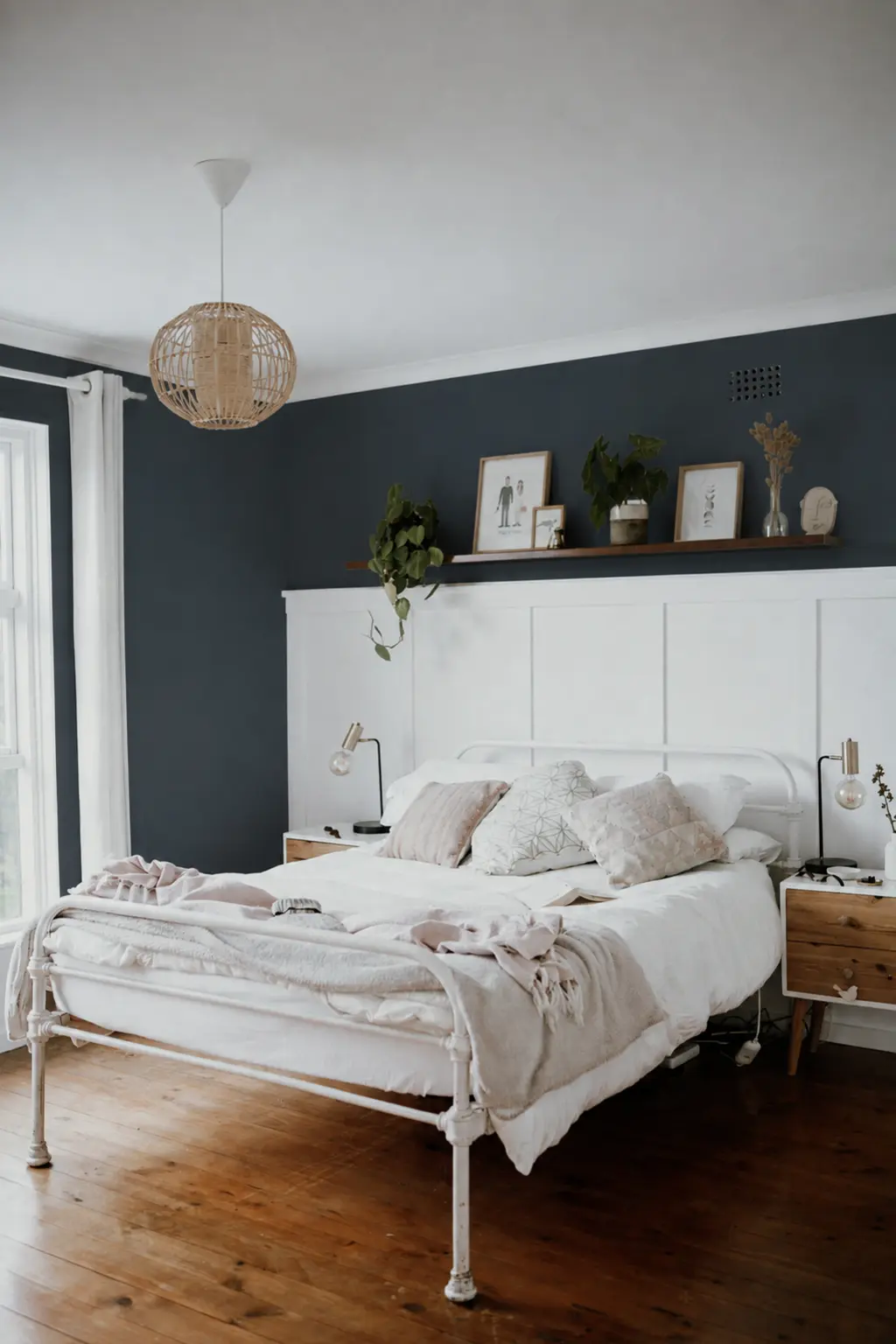
Digital references only. Sample real paint in your room.
MAKE COLOR ANSWER TO WHAT YOU OWN
Audit the room before the paint aisle.
Take a photo of the bedroom in daylight. Do not clean it first. I actually want the laundry basket there. The unedited room tells you what the paint has to live with; the staged room tells you what you wish you owned.
What is the floor doing?
Warm floors include beige or cream carpet, golden wood, tan, and most browns. Cool floors include gray carpet, blue-gray laminate, and cool stone. The floor is one of the largest color fields in the room. It gets a vote even when you are trying very hard not to look at it.
What is the largest piece of furniture doing?
Orange oak, dark walnut, black, cool gray upholstery, and white laminate do not ask the same thing of a wall. If the biggest piece is already warm and loud, the paint may need to quiet it. If everything is pale and anonymous, the paint may need to supply the backbone.
What color is the bedding you use in real life?
Not the duvet you have saved on Pinterest. The one currently on the bed. Bedding occupies a large amount of visual space, especially when you walk through the door. Light bedding gives dark walls room to work. Busy bedding usually needs a quieter wall. Cream can move warm or cool depending on what surrounds it.
Does the room already feel warm or cold?
Do not overcomplicate this. Walk in. What does it feel like? If everything is yellow, tan, orange, and warm, another yellow beige may finally turn the bedroom into oatmeal. If everything is gray, blue, and cold, another icy gray may finish the job and turn it into a dental office.
You are allowed to balance what is already there. Warm wood does not always need warm paint. Cool flooring does not automatically need a cool wall. The goal is not to match every undertone until the room becomes one continuous color. The goal is to make the fixed things look intentional together.
THE DIAGNOSIS
These are five different jobs.
NoisyMuddy blue-green
MismatchedMushroom
BoringMuted green
HardDusty mauve
ForgettableDark
A pale sage and a charcoal blue are not competing answers to the same question. They are different rooms.
THE FINAL TEST
Choose two samples. Not eight.
I will permit three if one of them is clearly there to settle an argument.
Look at each sample in the morning, afternoon, and after dark with your actual lamps on. Put it beside the floor, dresser, headboard, and bedding.
I care less whether you love the isolated paint color than whether you like your bedroom with that paint color. A screen can tell you, “I like smoky greens.” Fine. The physical sample tells you, “This smoky green makes my carpet look like ham.” More useful information.
Sherwin-Williams also recommends testing wall swatches at different times of day ↗
THE MONEY RULE
Do not buy anything else yet.
Do not choose a paint color, create a Pinterest board called BEDROOM REFRESH, and begin acquiring new bedding, curtains, rug, lamps, art, pillows, baskets, and some decorative wooden chain whose purpose remains unclear.
Paint first. Put everything back. Wait three days. Then look.
Maybe the dresser you were blaming looks much better against green. Maybe the cream duvet finally has contrast. Maybe the black lamp looks intentional against mushroom. Maybe you still hate the curtains. Fine. Replace the curtains then.
But do not make the paint project prove itself by spending another $600 around it. The paint gets first crack at fixing the room.
YOUR SHORT PLAN
You need one diagnosis.
Then seven moves.
- 01
Choose the family that fixes the room’s actual complaint.
- 02
Give veto power to the three expensive things staying.
- 03
Check what your natural light is doing.
- 04
Choose two physical samples.
- 05
Judge them beside the furniture morning and night.
- 06
Pick one and paint.
- 07
Put the same room back together before buying anything else.
At some point you have to stop optimizing beige.
You are not building the perfect bedroom. You are trying to stop walking into the one you already own and thinking, ugh, this room again.
Give paint first crack at the problem before you give your credit card the job.
SOURCES + VISUAL NOTE
The color families are editorial recommendations, not manufacturer shade matches. Screen color, paint sheen, wall texture, surrounding materials, and real light all change how paint appears.
- ROOM ORIENTATION + LRVSherwin-Williams: Choosing Color Based on Room Orientation ↗
- FIXED PIECES + COLOR FAMILYBehr: Bedroom Color Ideas & Paint Inspiration ↗
- SAMPLINGSherwin-Williams: How to Choose Paint Colors ↗
- ORIGINAL ROOM PHOTOTaryn Elliott on Pexels ↗